Scalable, Flexible, & Defined Structure
Quarks
Non-functional building blocks like color, typographic styles, and icons
Atoms
Basic Functional UI elements built from quarks like buttons, input fields, toggles, and chips.
Molecules
Combinations of atoms such as form fields with labels, buttons grouped with icons, etc.
Organisms
More complex components such as navigation bars, product cards, or modals.
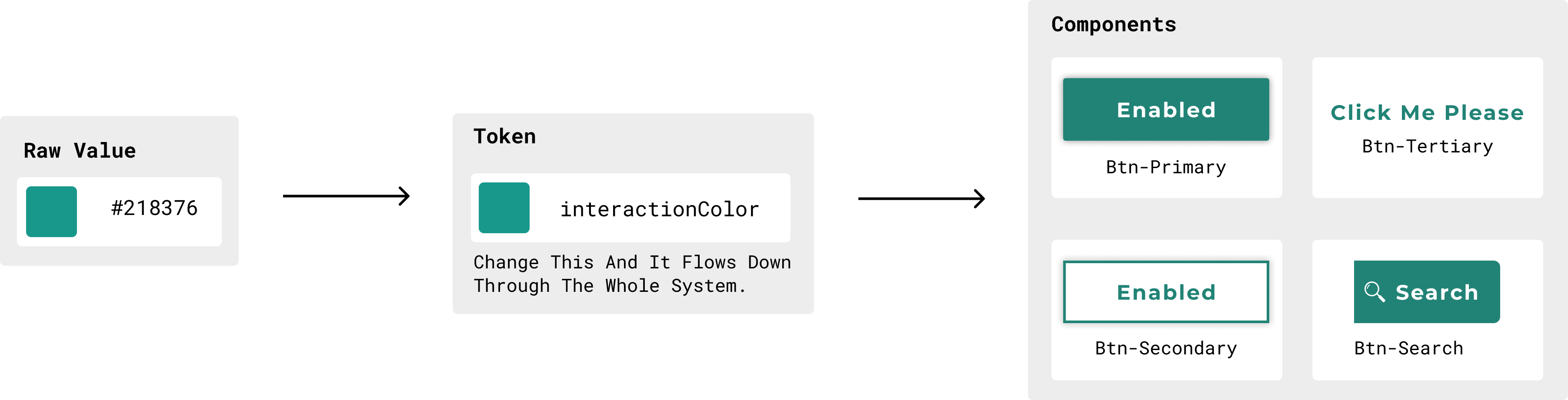
Future Proofing With Design Tokens
Design tokens (e.g., color, typography, spacing) were created to simplify management and updates of the design system. These tokens were implemented in both design files and the codebase (using CSS variables) to ensure consistency between design and development.
Converting Design System To Code
Development resources are limited, but I am determined to maintain the momentum. To keep the project moving forward I pivot to coding the library myself. To keep this project as light as possible I built on top of Bootstrap which was already being used. Maintaining the flexibility of the design tokens is important so I built the CSS using variables.
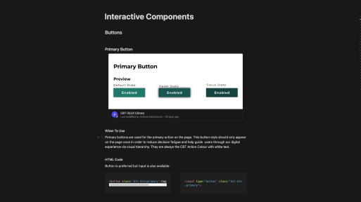
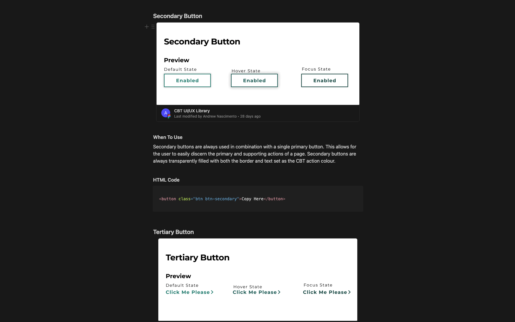
Documenting How To Use Design System
Without documentation the design system is little more than a collection of components. The documentation gives it the structure of how and when to use what pieces of it. After looking at multiple documentation platforms I settled between two for very different reasons. We would either use Storybook or Notion. Storybook was robust with built-in versioning and testing. Notion on the other hand was a lot simpler but provided the ability to move fast. Since this was an MVP and would be grown throughout its lifecycle we opted for notion with the plan to circle back to Storybook once we switched our development frameworks over to React.
Final Results
Design tokens (e.g., color, typography, spacing) were created to simplify management and updates of the design system. These tokens were implemented in both design files and the codebase (using CSS variables) to ensure consistency between design and development.
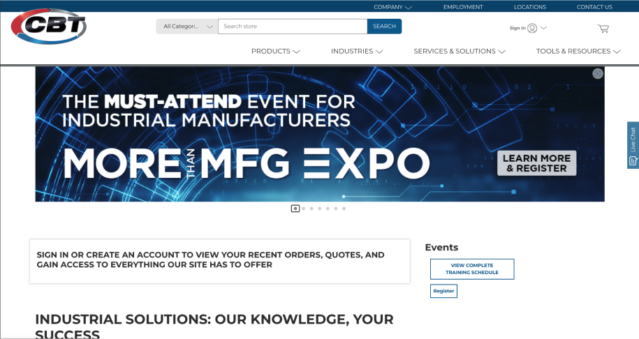
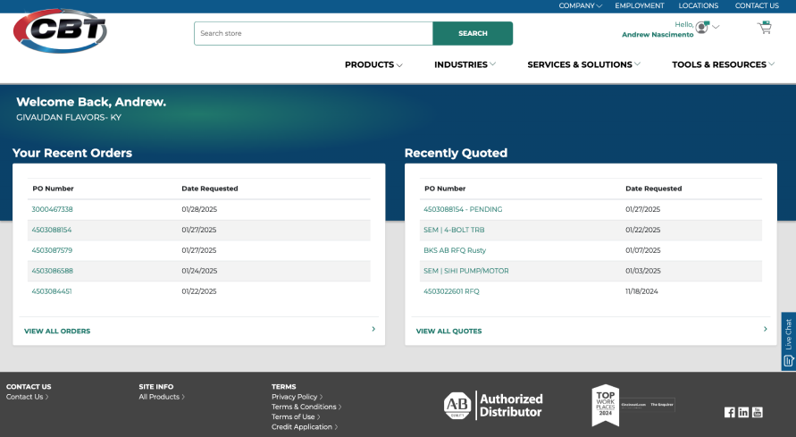 Ecommerce Website After Design system
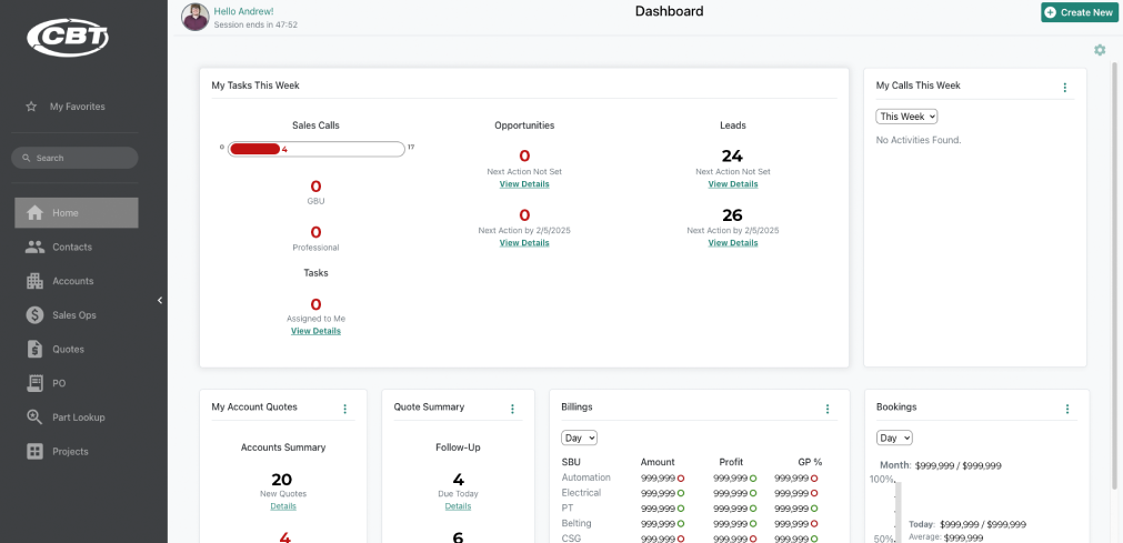 Mockup Of CRM System After Design system
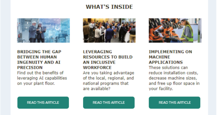 Email Template After Design system
 Ecommerce Website Before Design System
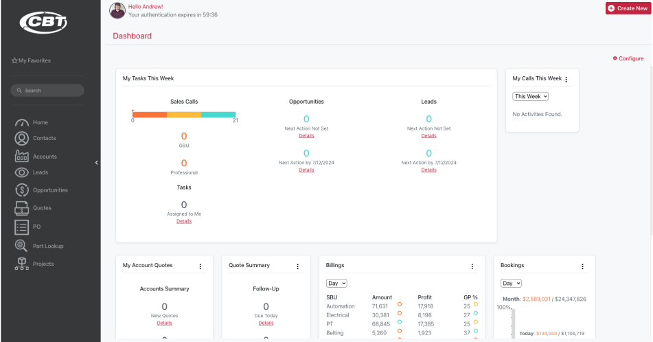 CRM System Before Design System
 Email Template Before Design System